When I rebuilt the website earlier this summer, I mentioned there was more to come on the visual side. It’s taken a while to get the colours and the mark feeling right, but I’m happy with where it’s landed, and I hope you can feel the difference scrolling through.
A reset, not a rebuild
As I touched on in the last post, this is less a new idea than a reset. I’ve always sampled colours from the covers rather than inventing a palette from nowhere, that part was never the problem. What I hadn’t managed before was sticking to it long enough for it to actually mean something.
Each Highland Rift Pack book has its own colour running through the magic on the cover, a deep emerald for Buried by Earth, a colder blue for Bitten by Frost, violet for Battered by Storms. I sampled those colours directly from the cover files, so when a post about Book Two turns up in someone’s feed, it’s already wearing Book Two’s colours, and the book they land on looks like the thing they just saw.
To actually build all of this out, I worked with the tools I already had rather than commissioning anything new: mainly Canva, along with AI tools for the backgrounds and textures. More on that below.
The wolf
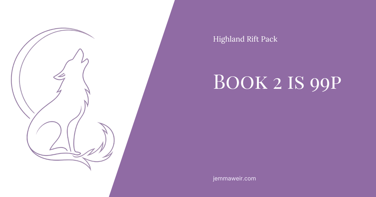
There’s a mark for the series now: a howling wolf inside a crescent moon. It took some trial and error to get it working at every size, but I’m hoping it ties the series together properly.
What surprised me was how differently it needed to behave depending on where it sits. The fine line-art version — all delicate strokes, fur detail through the tail — looks lovely at size on a webpage. Shrink it to the size of a thumbnail in a social feed and it more or less vanishes. So there are two versions now: filled and solid for social, where everything is small and busy and scrolled past in half a second, and the line-art original everywhere it can be seen properly.
Each of my series is getting its own mark in the same family. The wolf for Highland Rift Pack. An eye for Death and Visions. A scythe for the Old Gods books.
Social and the site aren’t the same problem
This was the other lesson. For a long time I treated the website and social media as one design job, and the results always felt slightly off in one place or the other.
They’re doing different things. The website is somewhere people arrive deliberately — light, calm, easy to read, room to breathe. Social is somewhere people are scrolling past at speed, so posts sit on deep, dark backgrounds pulled from the covers, with big text and a lot of contrast. The same soft palette that works on a book page would disappear entirely in a feed.
So they share a vocabulary — same typefaces, same marks, same colours — but they’re set differently. Once I stopped trying to make them identical, both got better.
How I actually built this
Some of the background imagery and texture work across the site and social posts was built using AI tools. I want to say that plainly rather than have anyone wonder.
My book covers are not part of that, and won’t be. Those are made by myself with bought images I created in Affinity, or by a cover artist I work with, and that’s not changing. The AI tools have gone into the things that would otherwise have been free stock photography or templates I’d have sourced and adapted myself, backgrounds, textures, atmospheric fills, the kind of supporting layer that sits behind the actual content. I know this is a topic people have strong feelings about either way, and I respect that. For me, it came down to using the tools I had available to do something I was always going to do myself, just faster, and I wanted to be upfront about that choice rather than quietly hope no one asked.
Where it’s going
There’s a fair bit still to come. New covers are in the works for the Highland Rift Pack, which will change some of these colours all over again — and when they land, the site and the social templates will shift with them.
That’s rather the point of building the system this way. Change the colour in one place, and everything else follows.
Thanks for reading along, Featherling.
May your magic behave and your monsters stay quiet,
Jemma